Russell Investments
Russell Investments
Creating bold simplicity for a leading global asset manager
Challenge
Russell Investments' former brand had served the firm well for many years, but it was evident that is was no longer aligned to a firm that was progressive, innovative and above all, a market leader. It was also clear that the firm's target audiences were becoming increasingly time-poor and were demanding information to be presented to them in a clear and simple manner.


Solution
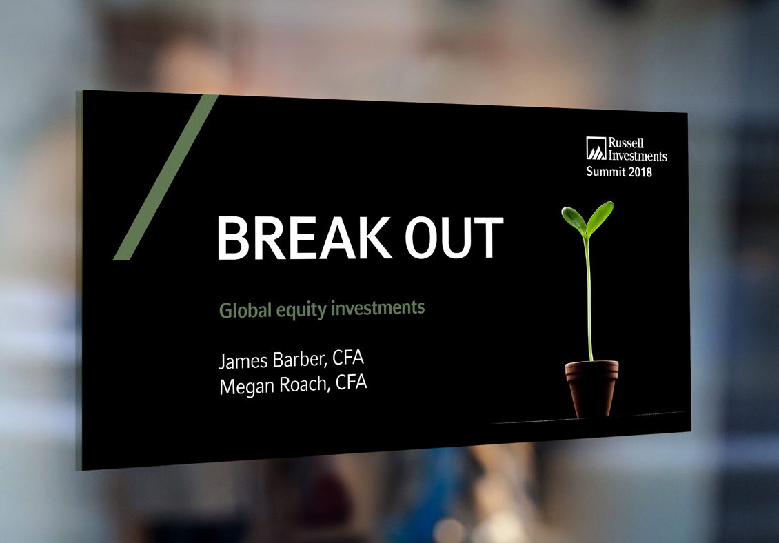
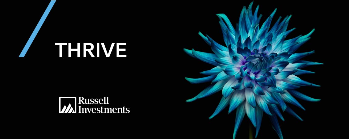
We conducted extensive briefing sessions with key minds at Russell Investments to establish their appetite for change and unearth the vital ingredients to drive our creative thinking. After auditing their brand collateral, we instantly saw that there was unnecessary clutter that needed to be cut back to reveal a more powerful and meaningful expression. The guiding principle of ‘bold simplicity’ therefore became the driving force behind a brand transformation that repositioned the firm globally.
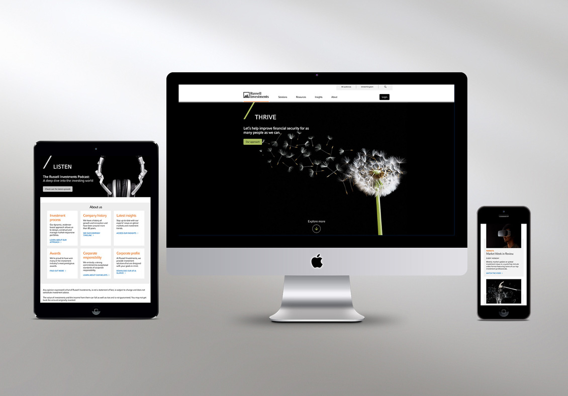
We simplified the firm's continuity graphic to become a meaningful component of the brand, expelled tired corporate people imagery and introduced a simple conceptual image style to work alongside bold, single word messages, which cut through the verbosity. Our work also simplified the design of editorial content both on and offline with clear and digestible guidelines that provided more realistic insight into how the new brand should be used.


Result
Russell Investments has firmly embraced the new brand identity and see it as a confident step forward, which reflects the true nature of their business and one that is resonating with their target audiences.
The new brand has also delivered significant cost savings through its digital-first approach and is allowing marketing teams to deliver communications with greater speed, clarity and impact. Assets under management have also increased to over $326bn (as of May 2021). Bold simplicity in action!