To affinity and beyond
To support future growth, RPC needed to address the brand gap that had emerged in recent years and elevate the profile of their broader sector and service capabilities, beyond the insurance industry.
An inspired look and feel
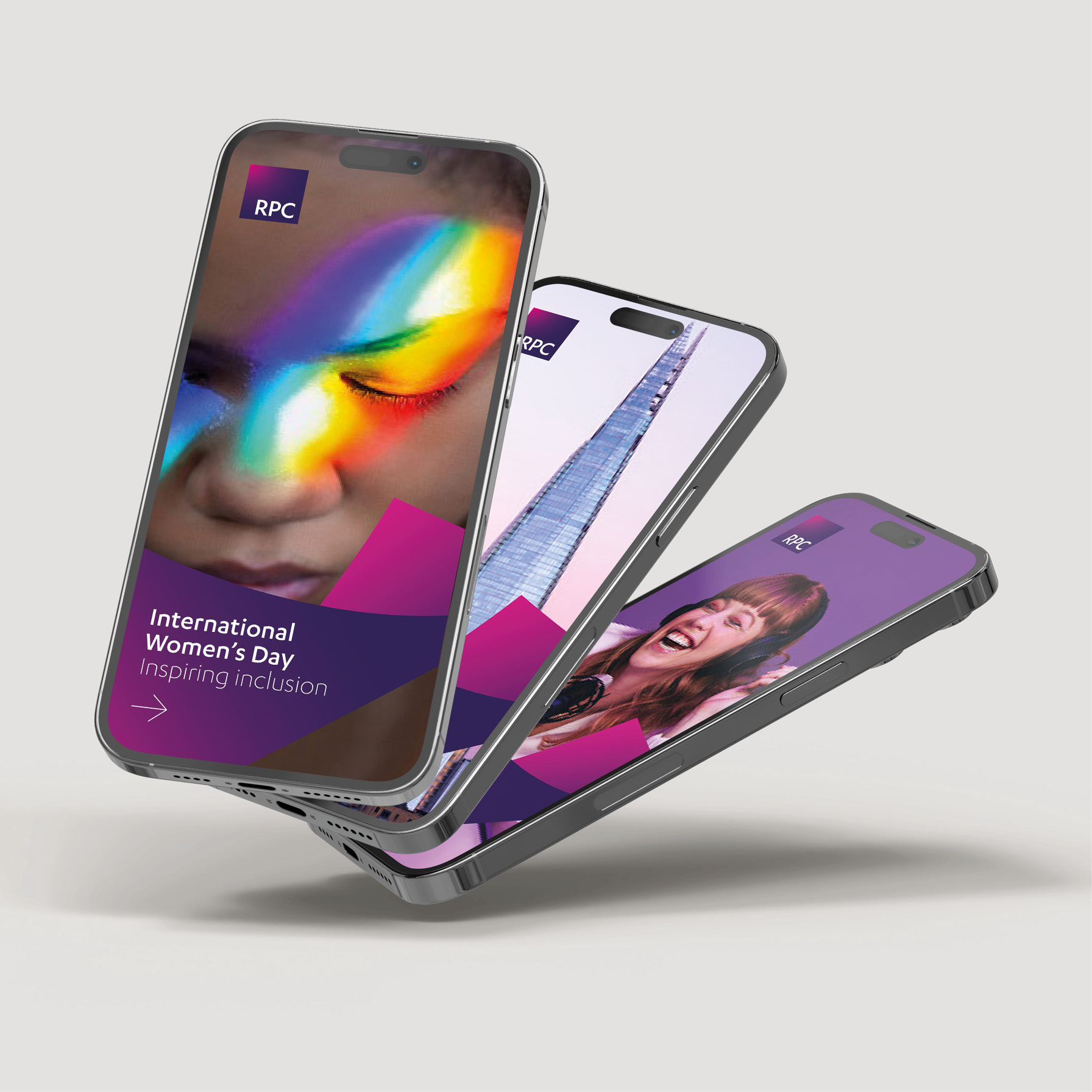
RPC were keen to retain the brand equity from their current logo while ensuring any new creative concept felt familiar yet revitalised. This was achieved by intricately aligning the corners of the logo with three-dimensional affinity waves, symbolising cohesion, and unity – firmwide attributes that were consistently cited during the extensive discovery phase of this project. The firm has also adopted a distinctive proprietary visual style to help make all communications more engaging and dynamic, which better reflect the firm’s culture and areas of expertise.
Proposition with purpose
The stunning creative was underpinned by the development of a new, audience first, values-based proposition statement, accompanied by a suite of messaging that conveyed the benefits of working with, and for RPC, at a firmwide, sector and service level.
A new digital destination
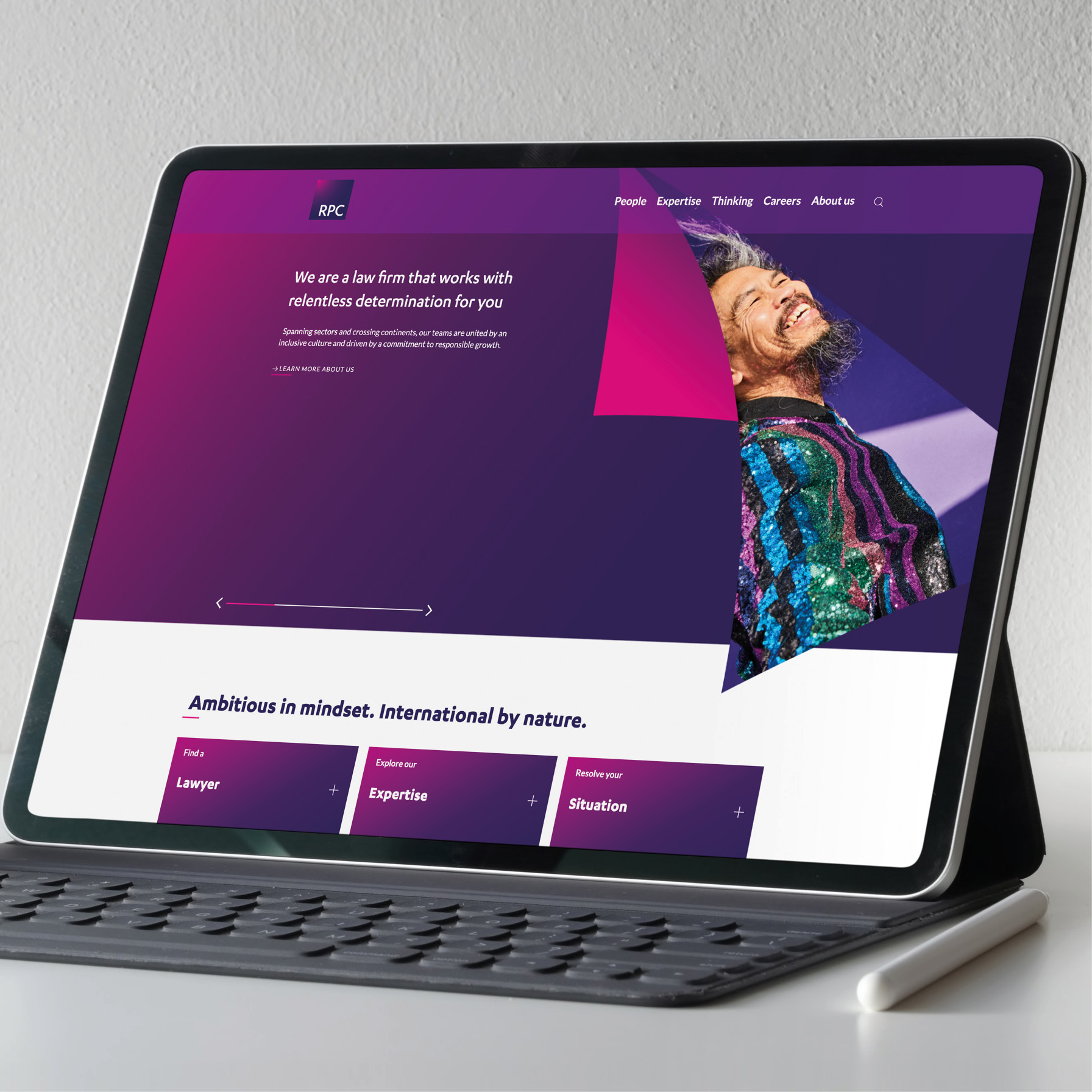
The new brand assets also influenced the design and structure for the new website. We simplified the site navigation, tightening the navigation, spotlighted their key sectors and services to reflect the firmwide capabilities and elevated their Responsible Business credentials and commitments
Commenting on the RPC’s brand and digital refresh, Living’s Chief Client Officer, Greg Hobden said:
It’s been an absolute pleasure working with the brilliant team at RPC and their passion for change was so refreshing. It’s allowed our creative and digital teams to create a brand that truly reflects the firm’s vision, personality and purpose and leaves no doubt about who RPC is, what they do and why they matter.
Want to know how we can create difference for your business?
To connect with one of our team, please contact Greg Hobden in London, Duncan Shaw in New York, or Gigi Yung in Hong Kong.


Latest news
Our latest insights, directly to your inbox


