UHY unveils a bold new brand identity
Years of brand fragmentation from an array of logo variants and inconsistent naming conventions led to an identity challenge that was diluting UHY’s presence as a global leader.
Together we embarked on an in-depth research and consultation process to reimagine the brand and unify UHY’s 334 major business centres across 96 countries under a cohesive identity.
Our brand strategy resulted in a one-logo approach, with descriptive sub-brands and a streamlined naming convention. We then strengthened the brand promise with the inspiring tagline ‘Connect to possibility,’ that communicates UHY’s commitment to providing a seamless client experience worldwide.
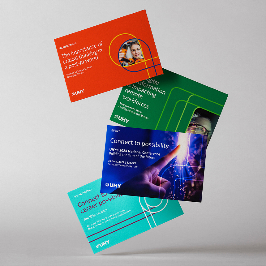
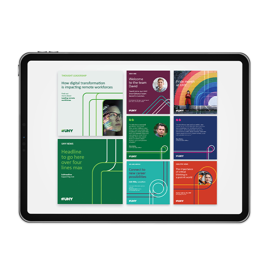
UHY’s proprietary visual language is centered around a striking shield icon, vibrant green colour scheme and line graphics, representing protection, growth, and opportunity for clients across a wide range of industries.
The rebranding marks UHY’s first major brand update since 2004 and represents a significant milestone in its evolution. “We have an ambitious goal of increasing the size and the geographic coverage of the UHY International network, and our new brand will play an important part in helping us to achieve those goals,” says Rhys Madoc, CEO of UHY International.
UHY’s new cohesive identity demonstrates the network’s unified commitment to adaptability, collaboration and providing exceptional client service – values that define the network’s past, present and future.
Find out more about our brand journey with UHY.
Is your brand keeping up with your firm’s vision?
If not, please contact one of our brand specialists: Duncan Shaw in New York, Greg Hobden in London or Aliena Lai in Hong Kong.


Related insights
Our latest insights, directly to your inbox


