TOI
A blockchain revolution starts here

A blockchain revolution starts here
TOI is a pioneering blockchain platform that’s set to disrupt and transform the industry, challenging legacy issues of scalability, security, and efficiency, through proprietary design and next gen technology.
As they developed the platform, TOI needed a brand that would stand out in a crowded market and provide a springboard for clear communication of its benefits to wide ranging target audience, from financial services firms and investors to blockchain developers, influencers, and government agencies.
Working with a name that is inspired by the recently discovered planet 'TOI-700', an Earth-like celestial body located approximately 100 light years away, provided our team with a rich source of inspiration and a sound brief.
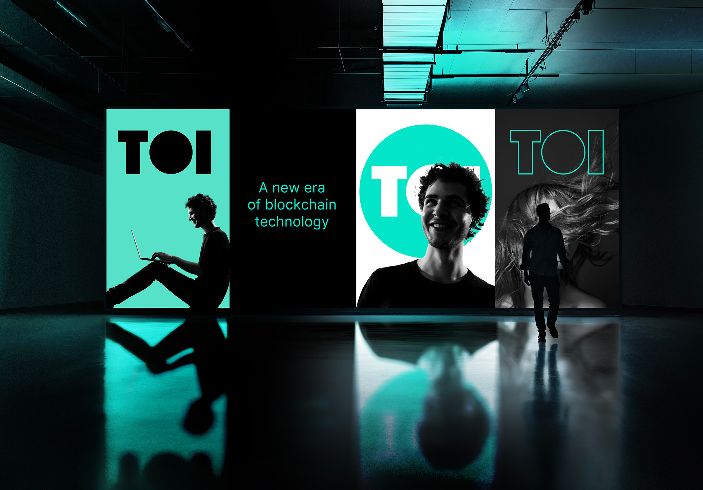
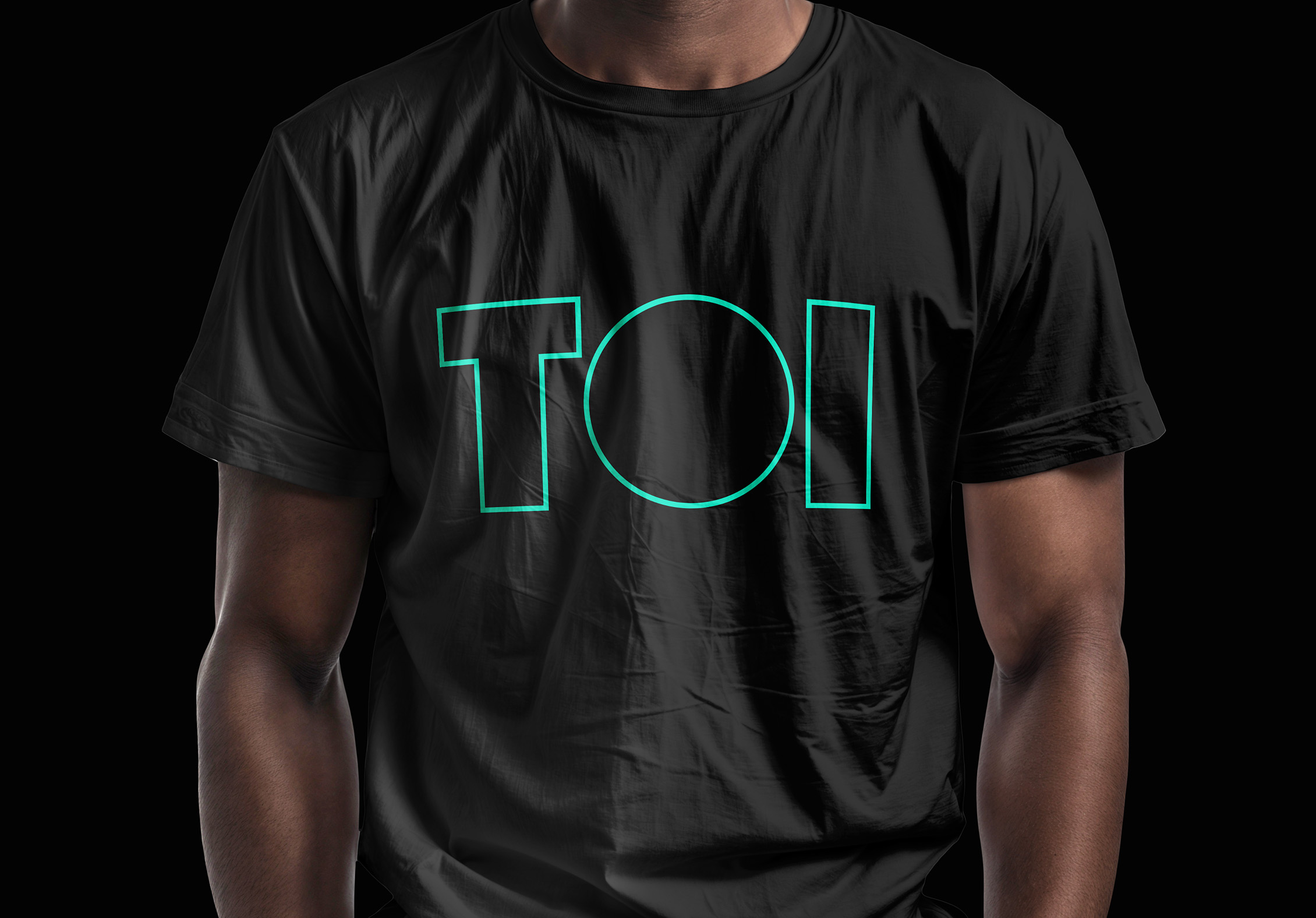
Embodying the spirit of unexplored potential, the name ‘TOI’ symbolises the limitless possibilities that the platform aims to unlock. The visual identity centres around the perfect sphere in the logo, reflecting boundless versatility and agility, conveying the platform's commitment to pushing boundaries and spearheading innovative advancements within the blockchain industry.
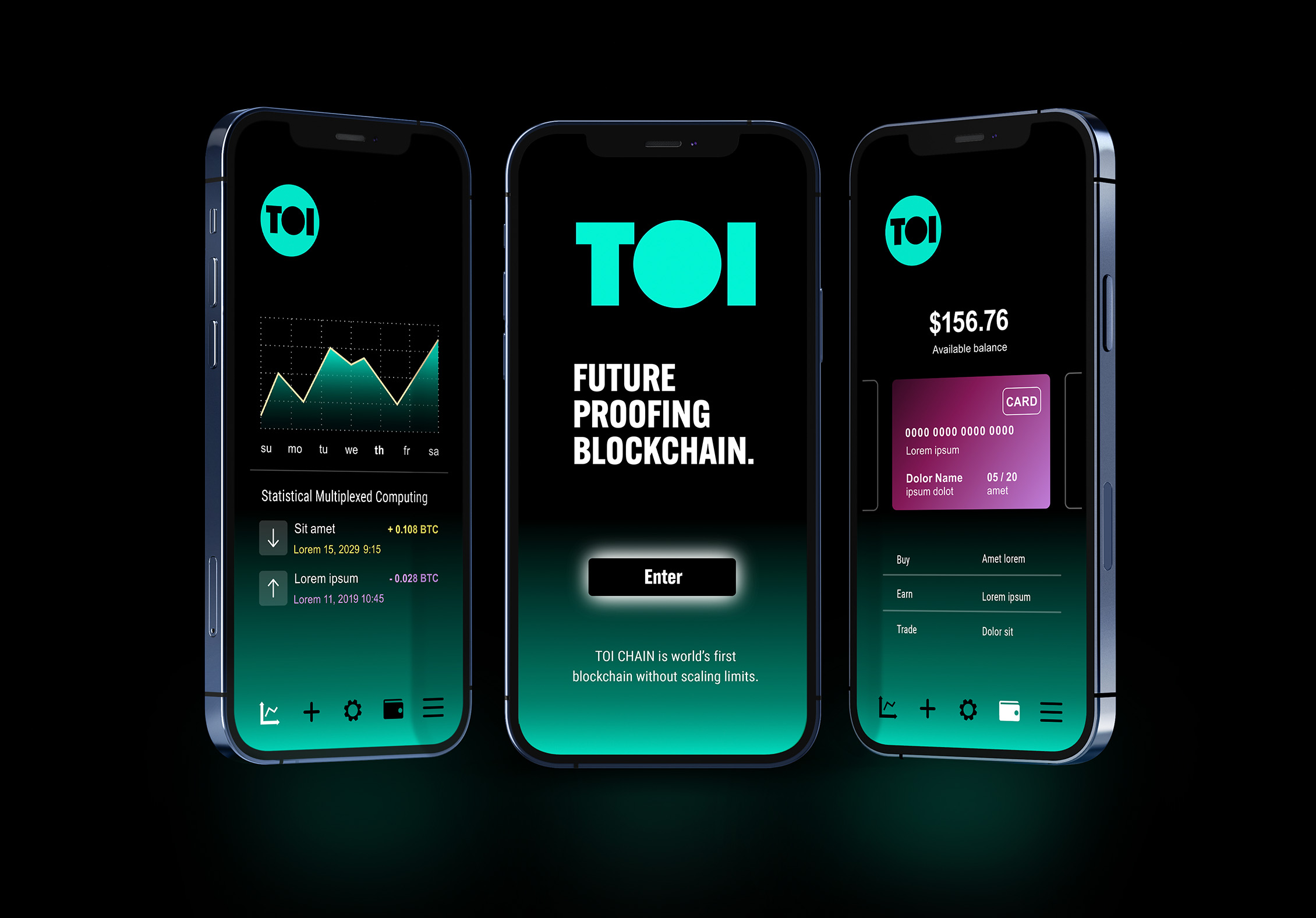
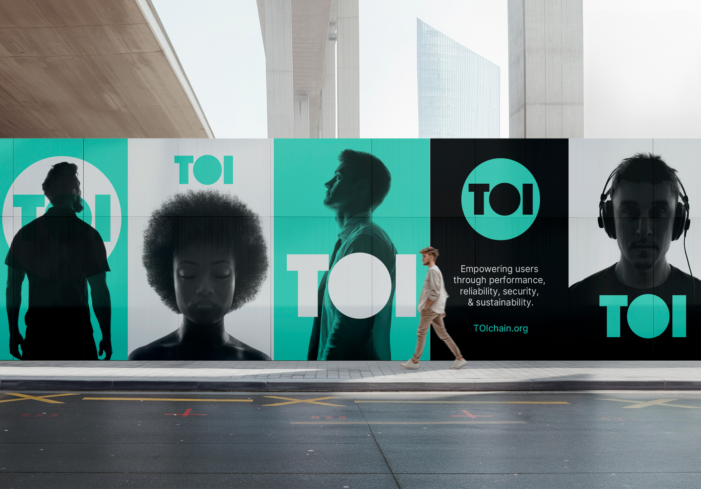
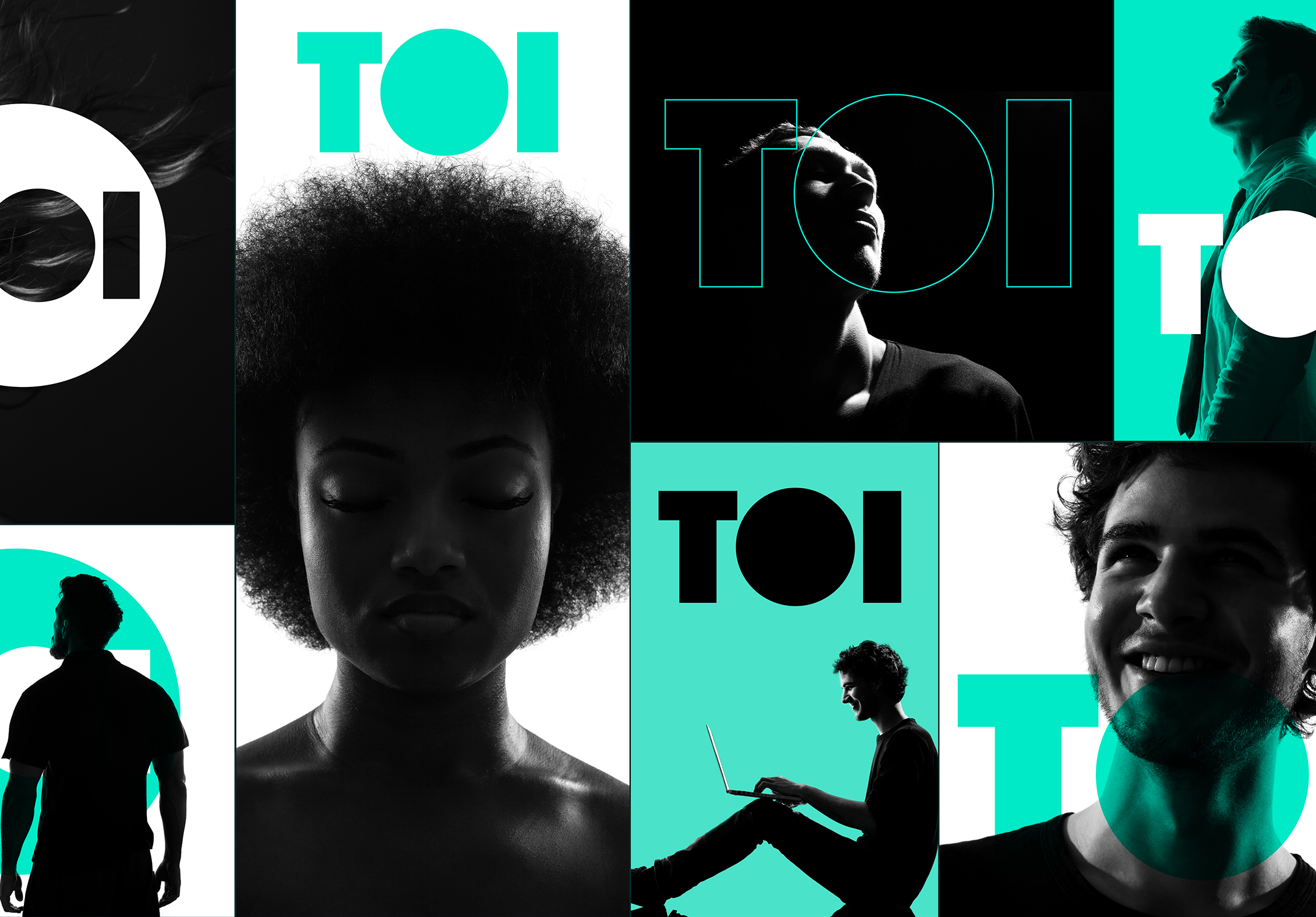
The supporting visual language is deliberately efficient, with a paired back colour palette and clean typography, incorporating humanity – a rarity in the blockchain landscape.
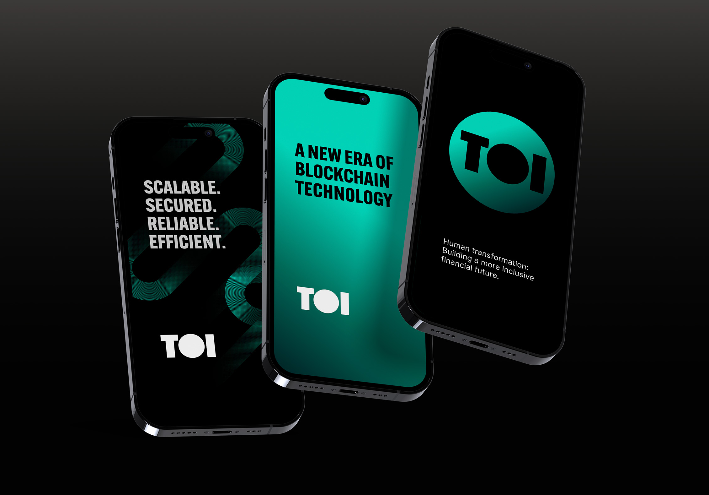
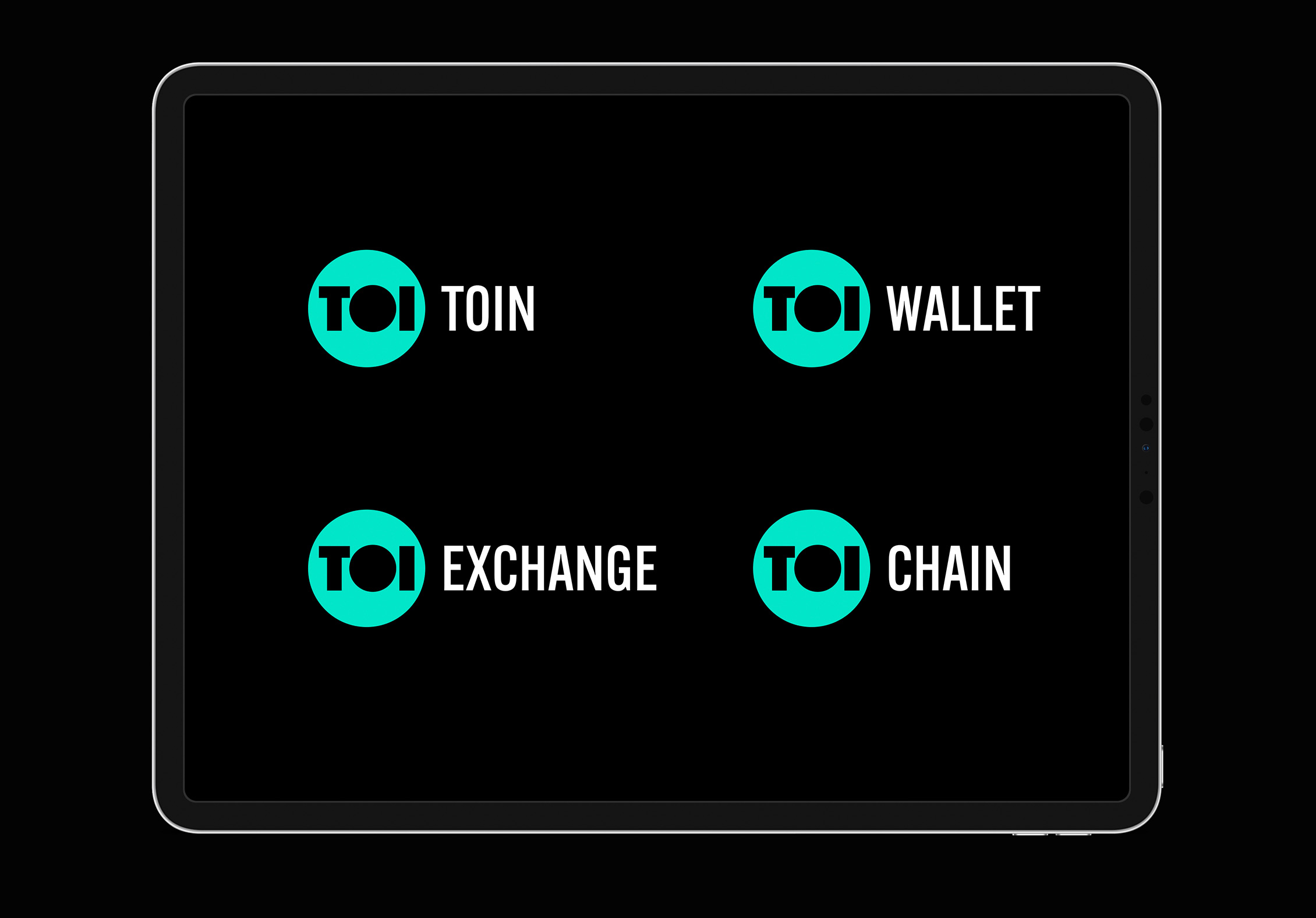
The brand also extends to work with TOI's blockchain products and services, from coin and exchange to wallet and chain.
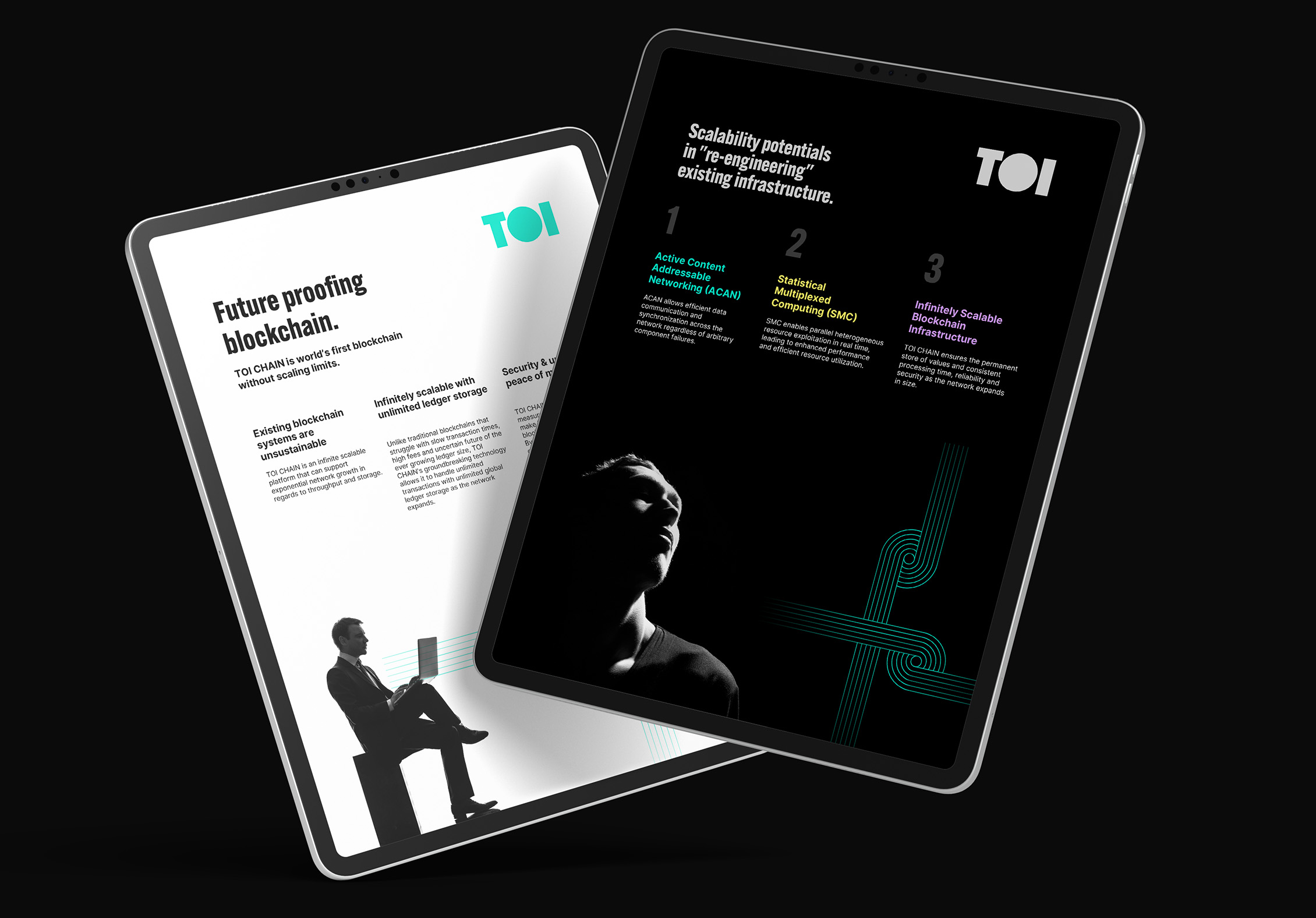
The result is a brand code that allows TOI stand out from the clutter, complexity and chaos of its competitors. It’s a visual calling card for a new era of blockchain technology, signalling the arrival of a transformative force within the industry.
