Harneys
Launching a vibrant and progressive
brand for an offshore law firm

Launching a vibrant and progressive
brand for an offshore law firm
Established in the British Virgin Islands in 1960, Harneys is a leading international offshore law firm with offices in 12 locations globally. They came to us with the beginnings of a brand identity that clearly needed a conceptual grounding and strategic infrastructure to govern its usage effectively.
Our aim was to truly humanise the Harneys brand and express them as a fun, friendly and approachable firm with a commercial and pragmatic mindset.
After conducting an extensive discovery activity with selected Partners in each of the 12 Harneys offices, we were able to establish a clear strategic direction for the new brand. This deeper understanding of Harneys as a firm gave us a firm footing on which to propel our creative thinking.
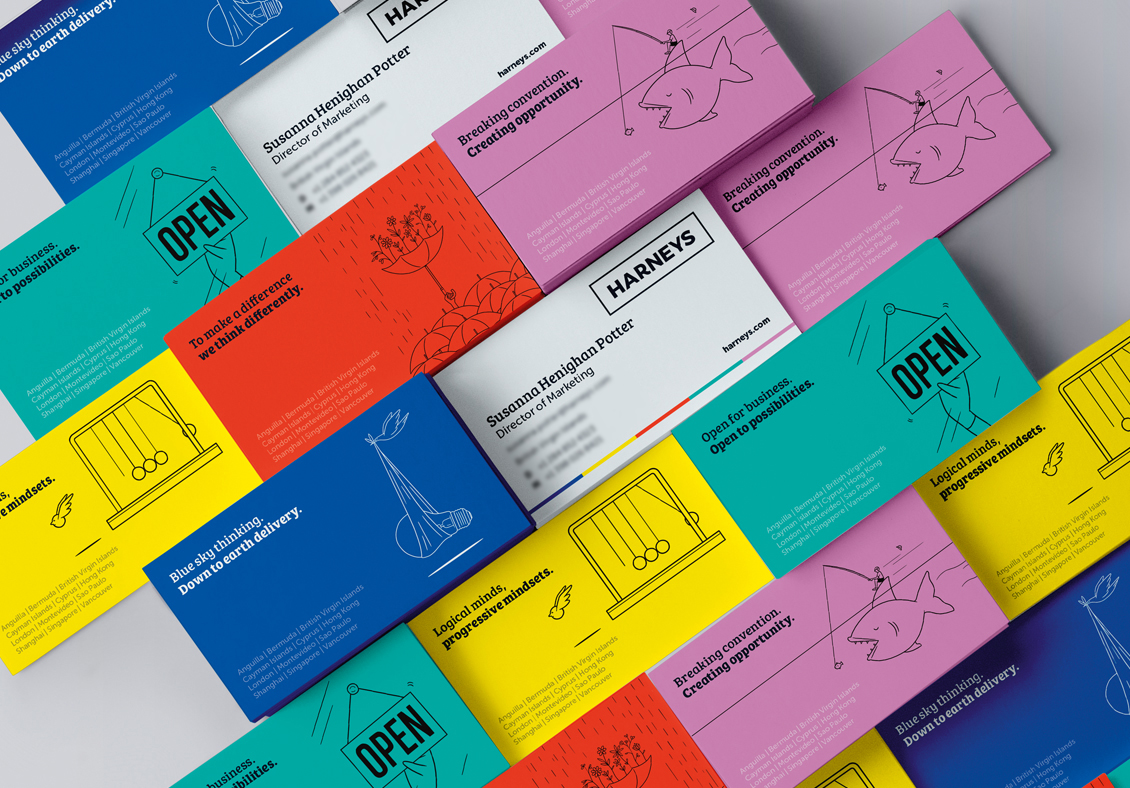
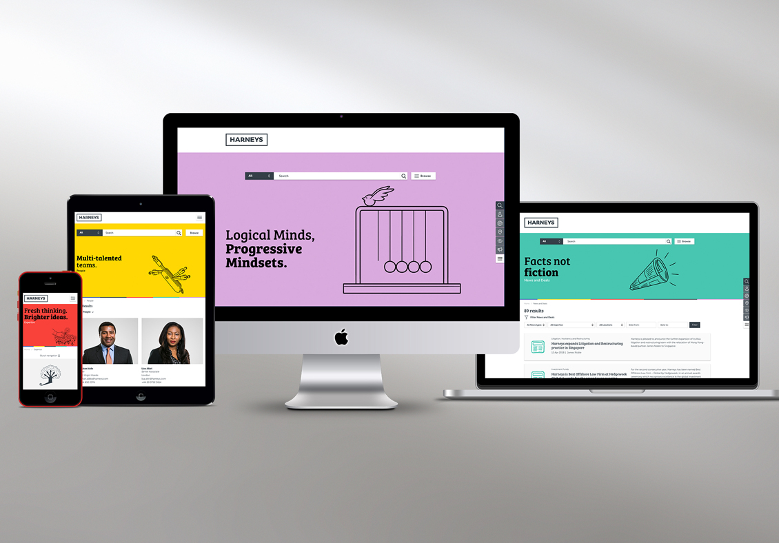
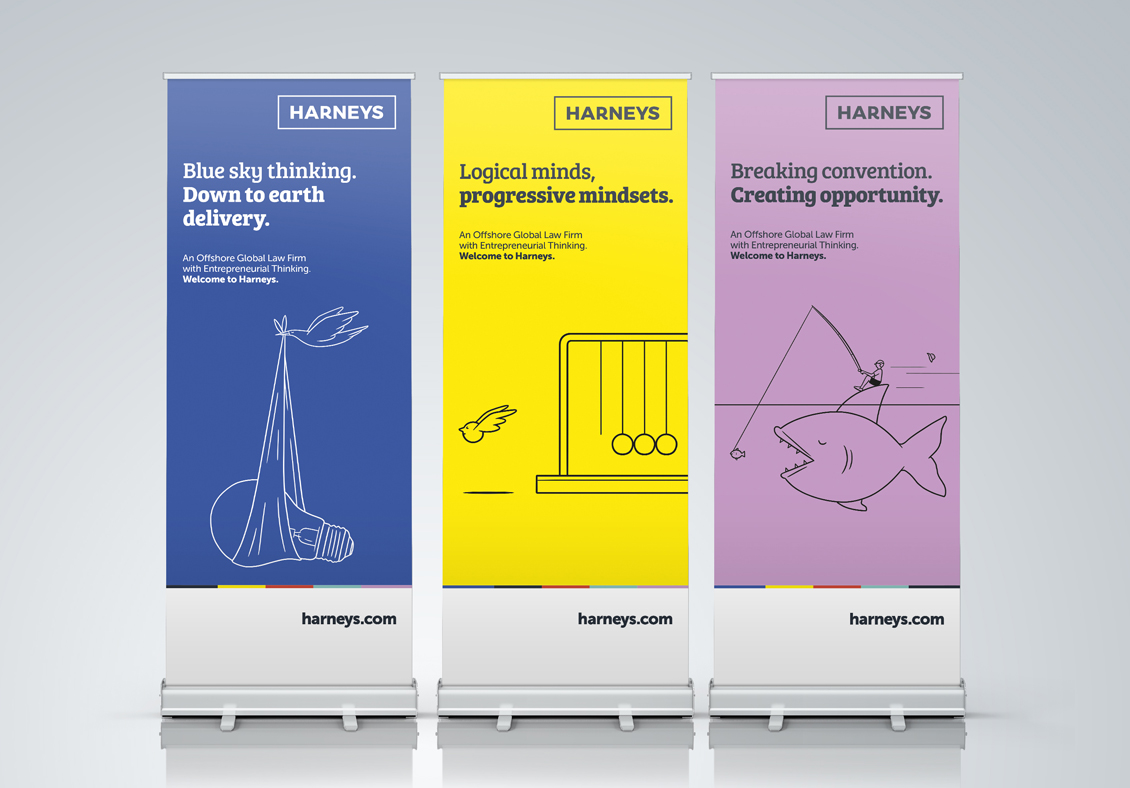
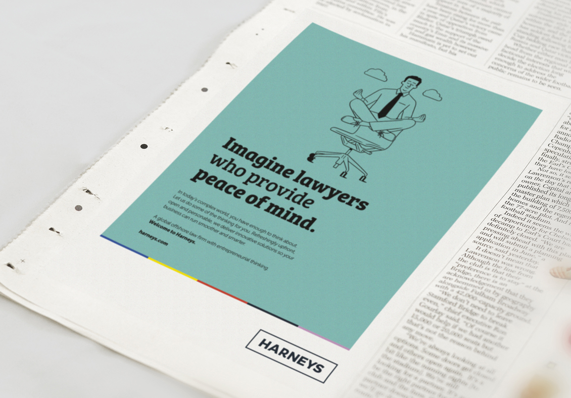
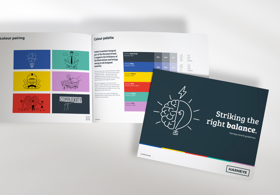
We then developed a visual identity that was more cohesive, ordered and fit for purpose. We re-crafted the brand marque to inject a more approachable aesthetic. We revitalised a colour palette and gave the colour bar continuity graphic a relevance in the visual language.
Finally, we sourced a number of illustrators and worked in partnership to develop smart and playful illustration concepts to work across all print and digital brand collateral.
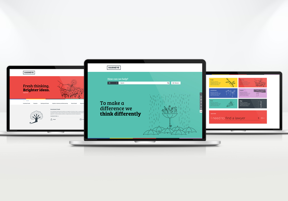
The formidable transformation of the Harneys brand image came to life in a user-first, search-driven website that confidently stepped into a friendlier space by leveraging playful illustrations and bold, bright colour. They now stand in a distinct territory that sets them apart from the wash of blue law firms that dominate the offshore and global legal 'brandscape'.
To see the new Harneys brand in action visit https://www.harneys.com/
“The brand and website is a huge transformation and step forward for Harneys. The feedback has been very positive and I am very proud of what we have achieved.” Susanna Henighan, Director of Marketing, Harneys