PineBridge
Creating brand distinction for
PineBridge in a crowded market place

Creating brand distinction for
PineBridge in a crowded market place
PineBridge had enjoyed significant success over several years, expanding into new territories and gaining investor confidence.
However, their brand identity didn’t accurately reflect their distinguishing qualities of being sharp, focussed and dynamic. As a private global asset manager, PineBridge had always maintained a steadfast focus on active, high conviction investing which was fuelled by a deeply analytical approach. Our aim was to bring these differentiating attributes to life through a more intelligent and compelling visual identity.
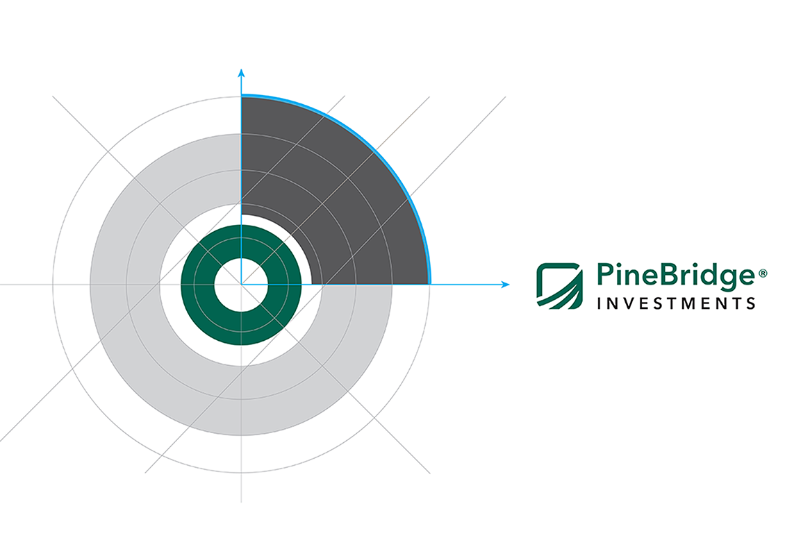
We conducted a discovery activity with global stakeholders at PineBridge which was vital in surfacing a distinct guiding principle of ’Seeing value where others cannot’. This would subsequently become the bedrock on which we built a fresh new visual identity that aligned with their values and purpose. Our concept pivoted on PineBridge’s strength to detect and respond to subtle changes, trends and obstacles that others miss. The visual execution of this concept was inspired by the dynamics of sonar and was brought to life as a series of interlocking rings with an area of focus that rotated around the radius. At the core of the identity was an inner ring which was designed to change its graphic style according to the four tenets of the PineBridge brand: Collaboration, active, high investing, analytical and nimble.
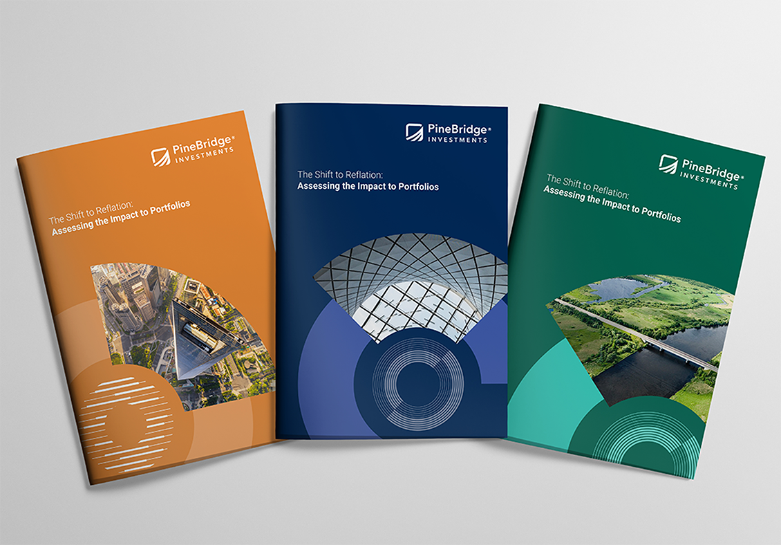
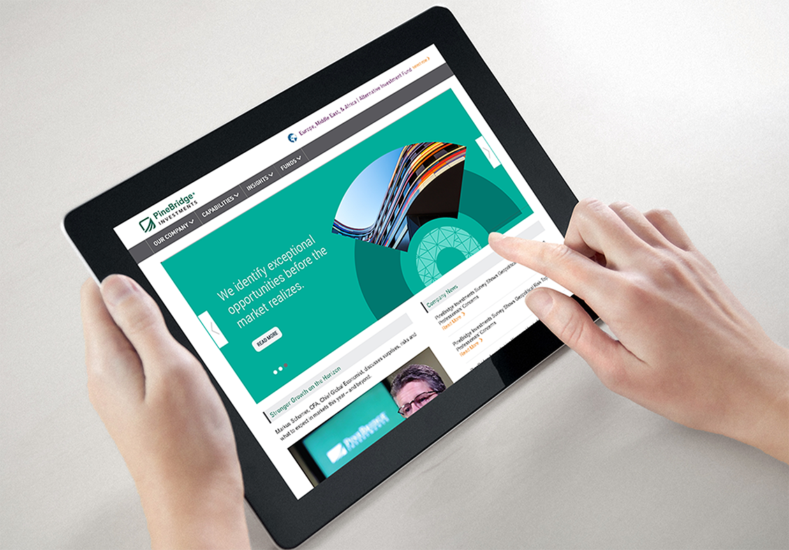
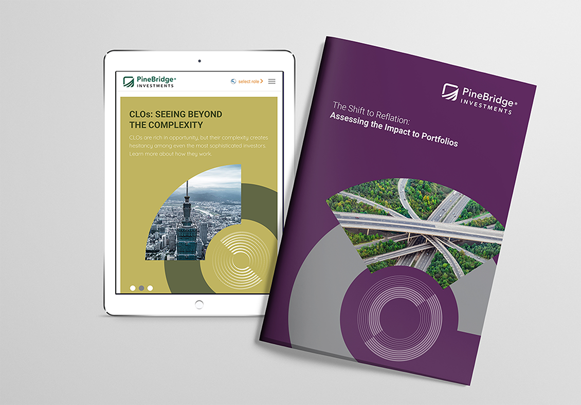
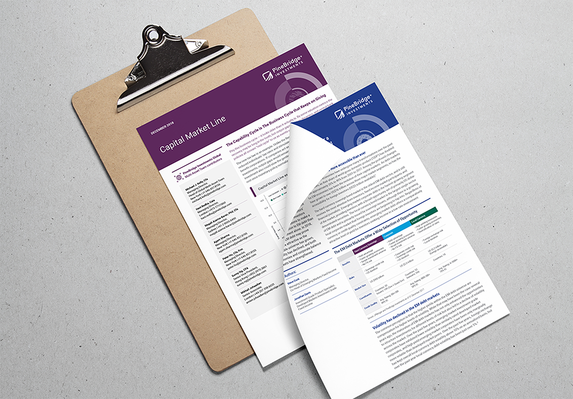
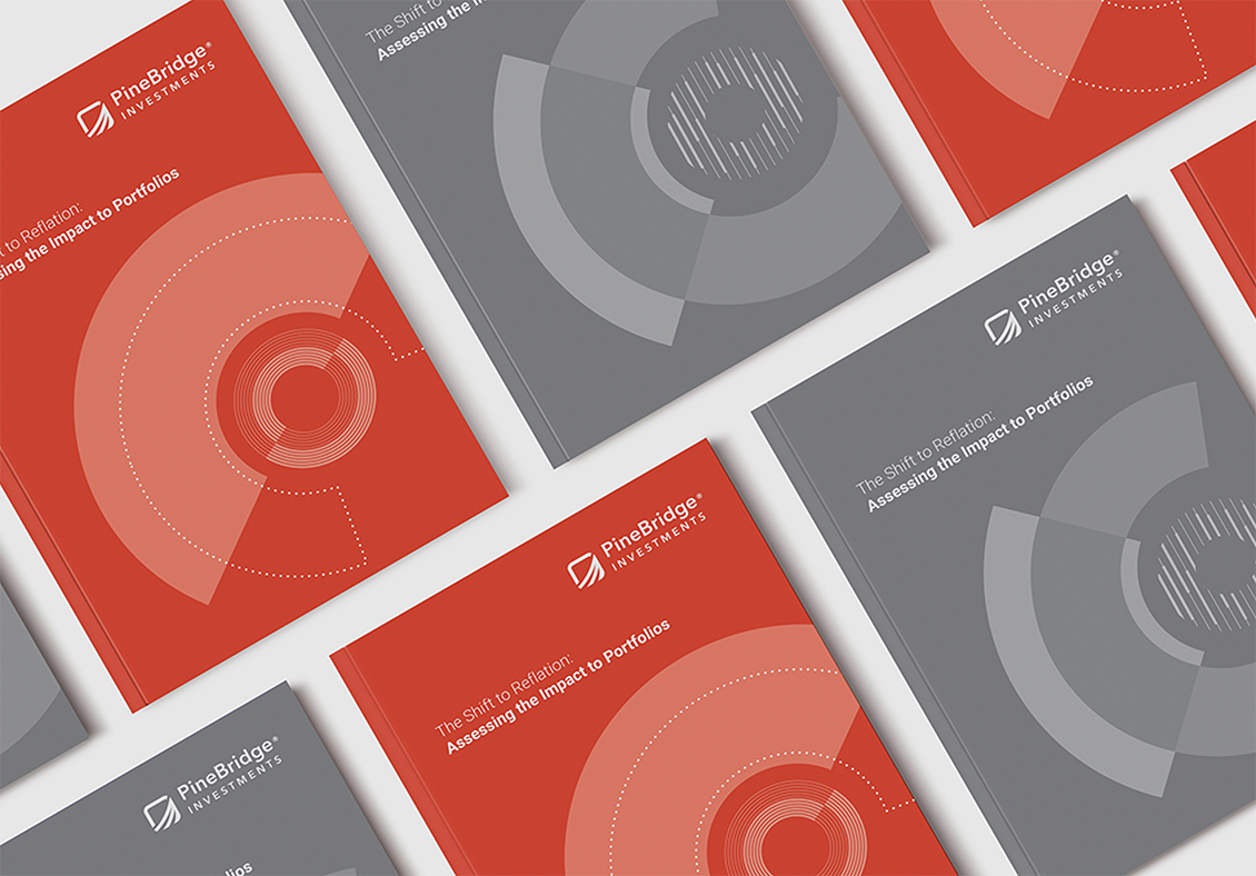
We were able to revitalise the overall design using a more energetic colour palette and a flexible graphic system along with a new photographic style that used different perspectives to support the overall guiding principle.
To see the new brand in action click on pinebridge.com