Potter Clarkson
A law firm brand that moves with its clients

A law firm brand that moves with its clients
Potter Clarkson has long been recognised as a top tier European intellectual property law firm.
Following a rapid period of growth – expanding its service offering, opening four new offices in two years and growing to a 200-strong practice - the firm found itself at an exciting juncture. However, there was a distinct mismatch between the firm’s progressive approach to delivering intellectual property legal services and the way it articulated its offer to the outside world.
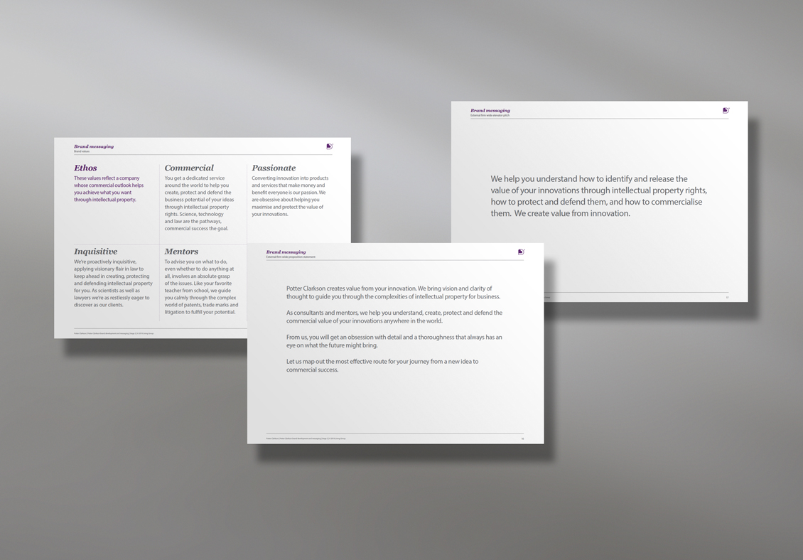
Our initial conversations focused on how we could help Potter Clarkson effectively articulate its difference in a specialist legal sector. We embarked on an in-depth discovery phase to unearth the authentic evidence both internally and externally that would give Potter Clarkson a solid foundation on which we could build a robust brand messaging platform and a more dynamic brand identity that would reflect who it is today.
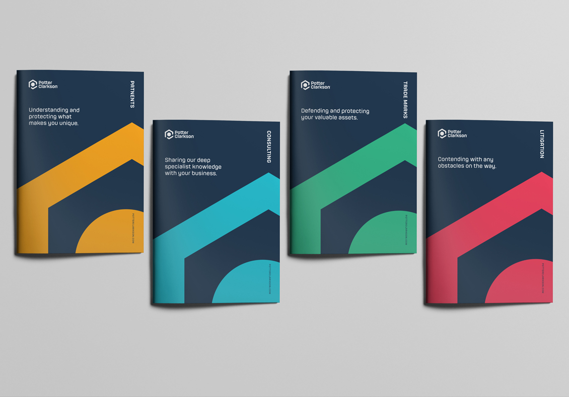
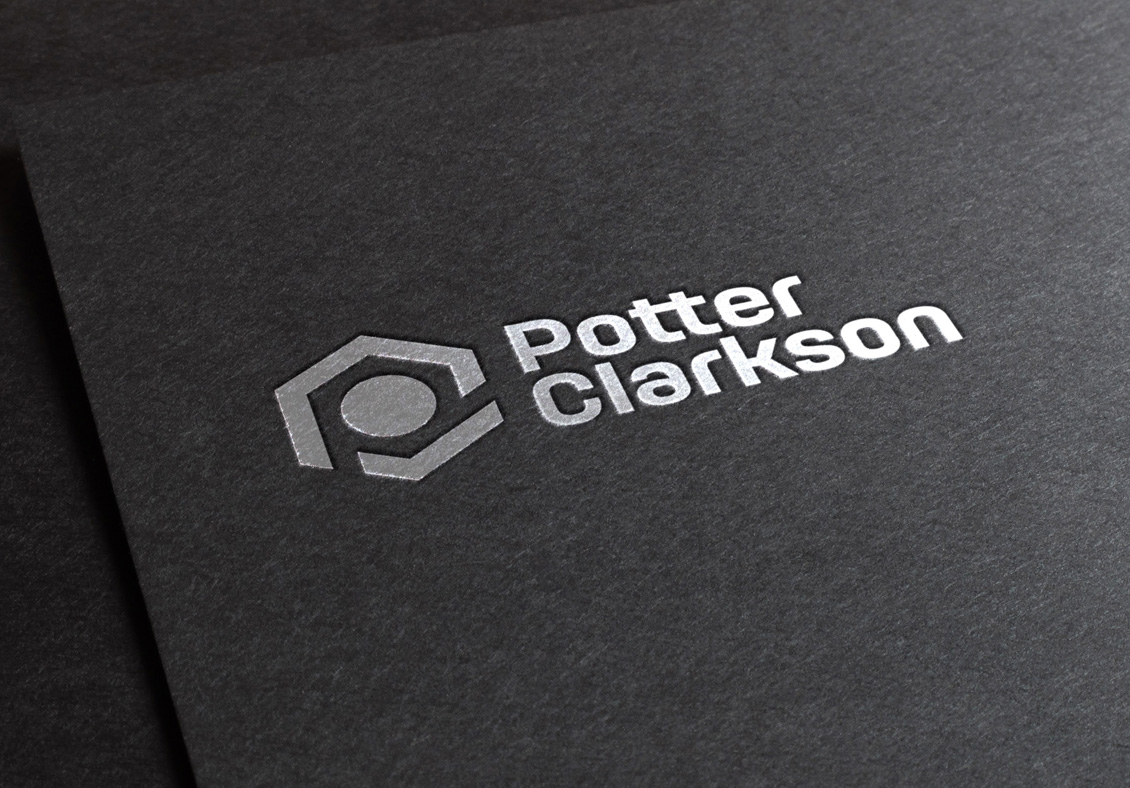
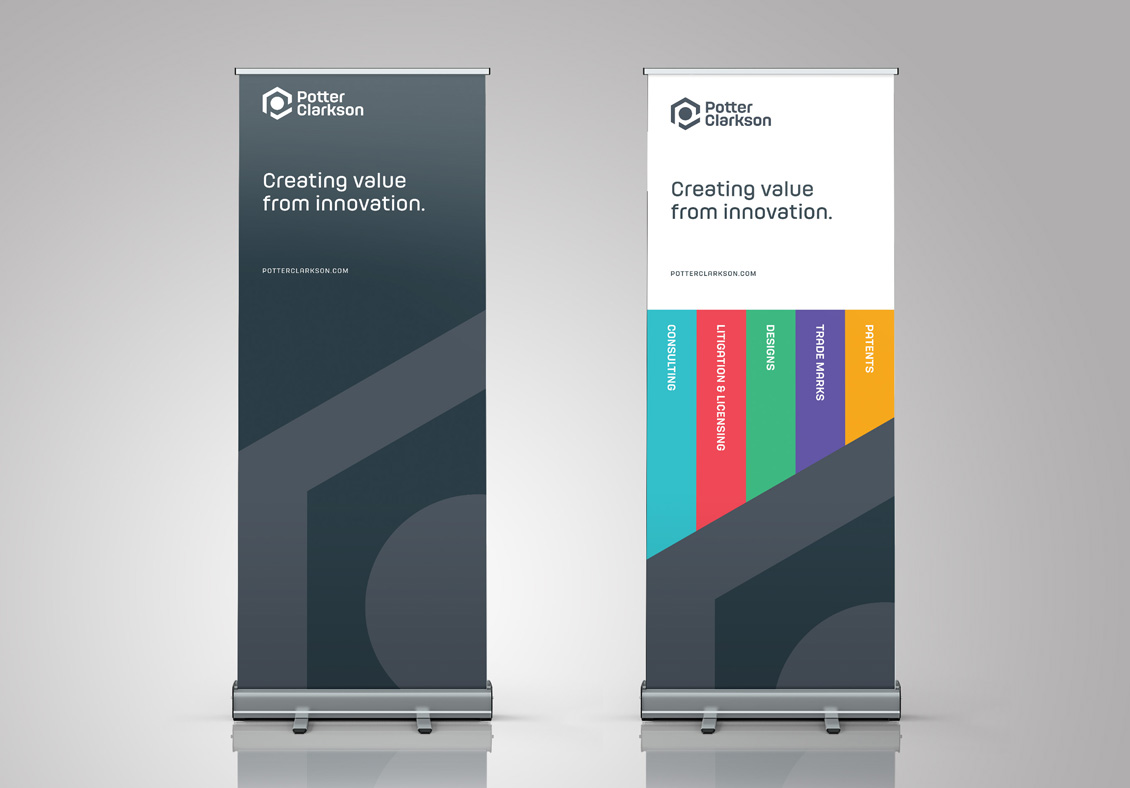
Our solution was a brand marque that expressed Potter Clarkson’s ability to see the bigger picture of how IP can support their clients’ business goals, while simultaneously honing in on the detail. The marque is a stylised minimalist expression of the firm’s drive to create value from innovation.
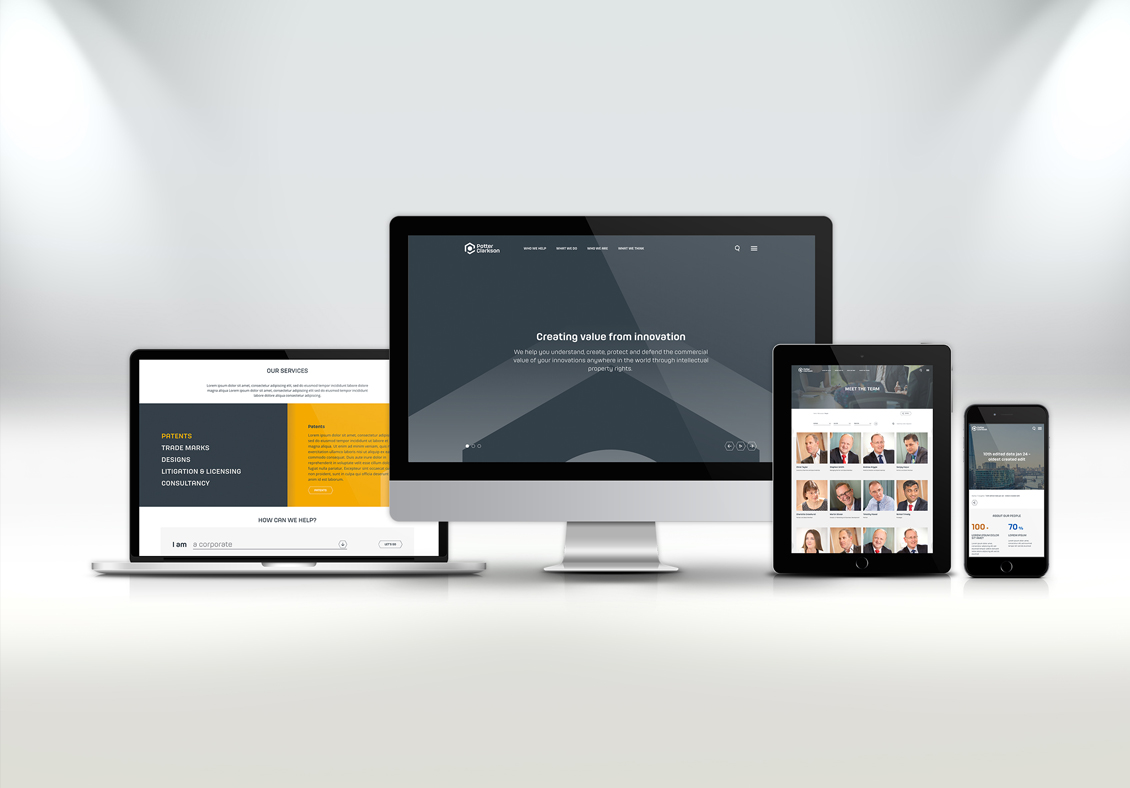
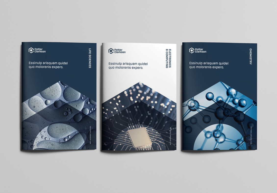
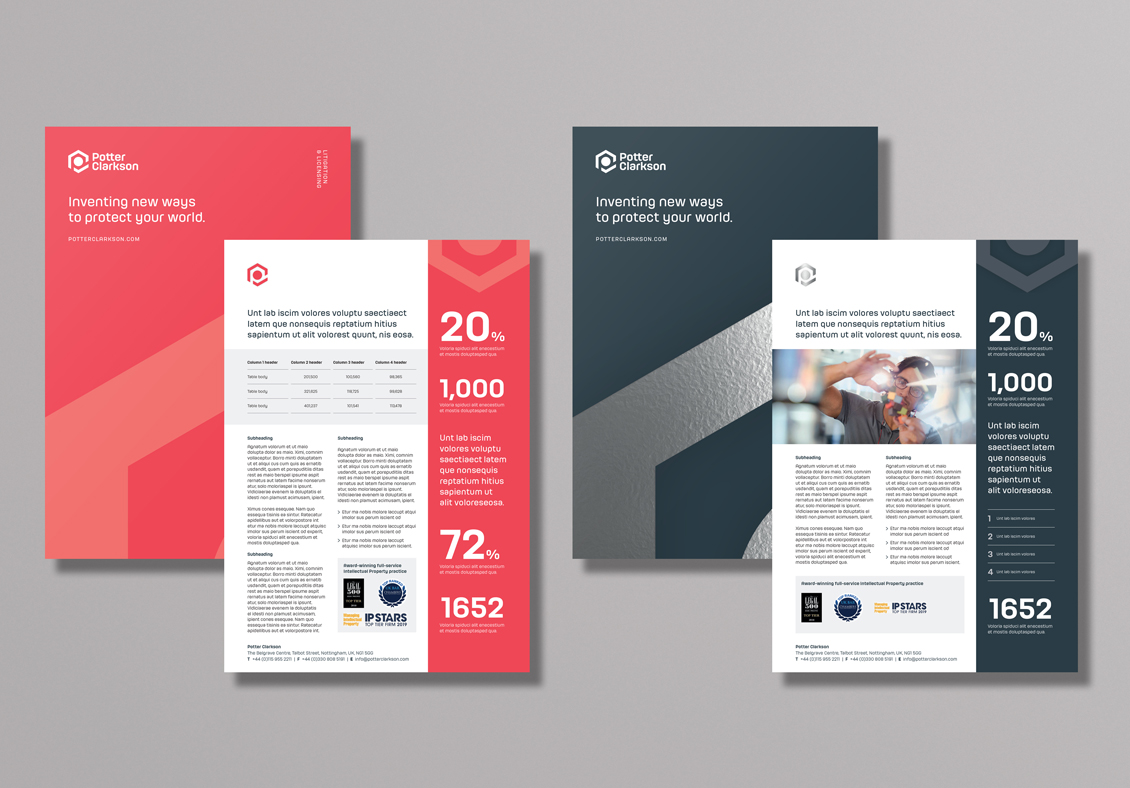
The broader visual language was influenced by the foundation of the logo, manifested as a complementary icon set and a flexible brand graphics system. Additionally, we worked on a totally new user experience for the Potter Clarkson website that leveraged greater focus on the difference their work makes to clients, a more intuitive persona-based search and improved content strategy.
Potter Clarkson now have a brand identity that authentically reflects its contemporary positioning and future focus. To see the new Potter Clarkson brand in action visit potterclarkson.com